The teal colour palette isn’t often seen in nature. But when it does, you certainly remember it, which is exactly what makes it such a good starting point for inspiration. While it is often used more generally to refer to any shade of cyan or turquoise, true teal is a kind of bright blue with greenish overtones.
Its name comes from an unlikely source – the green-winged teal, also known as the Eurasian teal, a kind of widespread wild duck with a patch of bright, blue-green feathers behind its eye and on the underside of its wings. These iridescent feathers are most prominent in flight, showing off the colour seen in the world without artificial pigments.

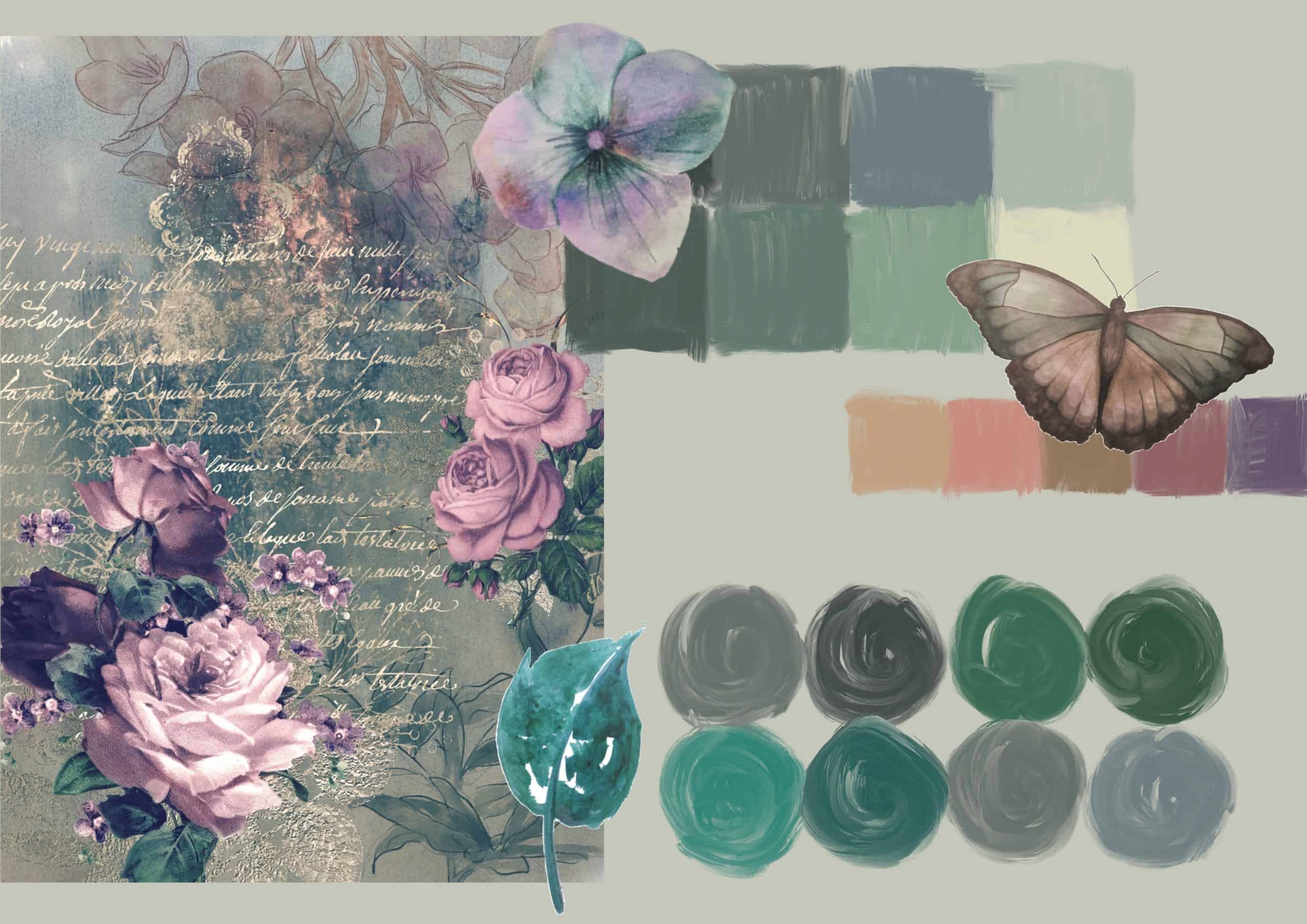
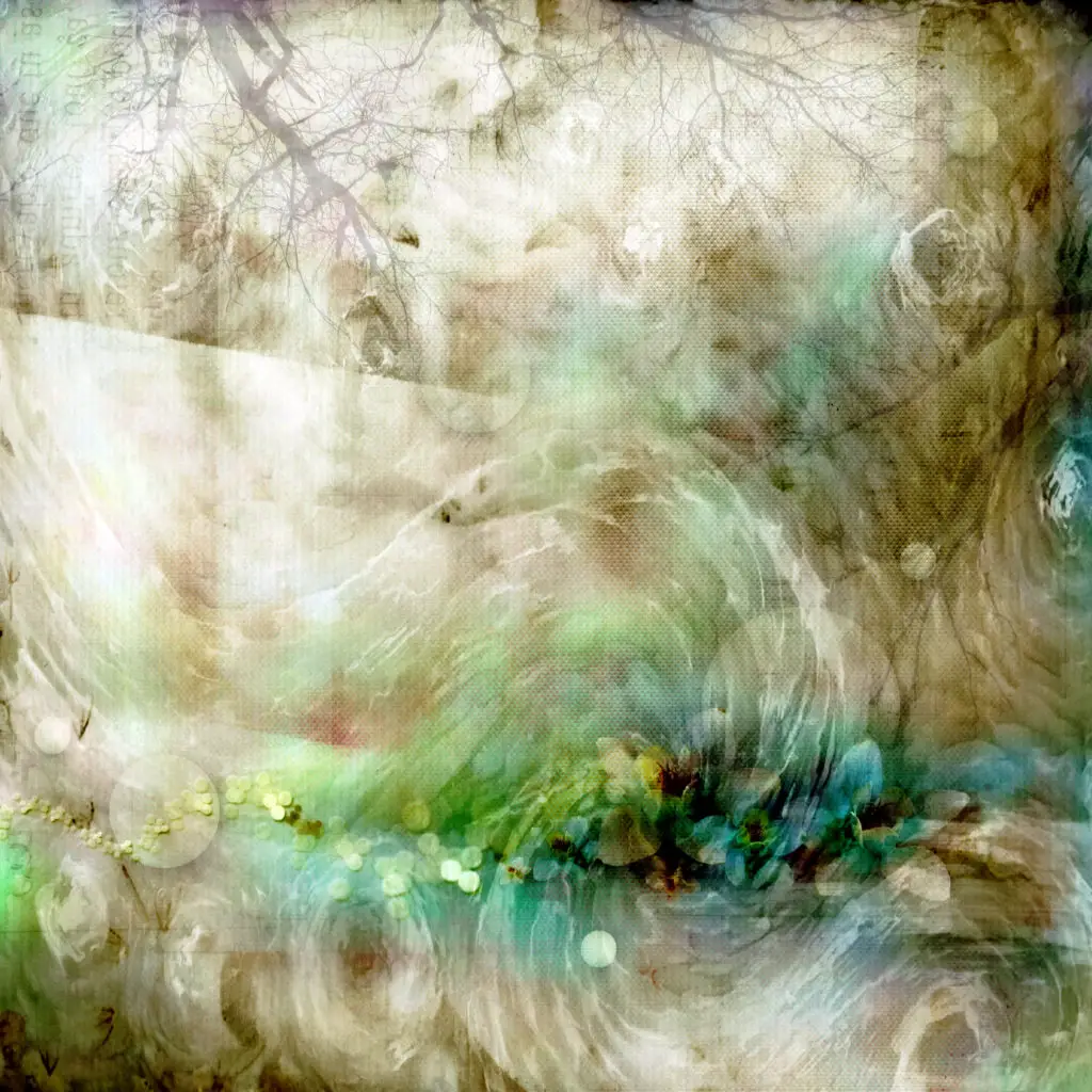
Most commonly, this colour appears in particular types of water, the feathers of waterfowl like ducks and kingfishers, the wings of butterflies, and particular kinds of precious stones and plantlife. This blue-green colour, so bright it seems to almost glow, is best used sparingly in a colour palette, as it is used in nature, when incorporated with more destaurated shades to make it pop.
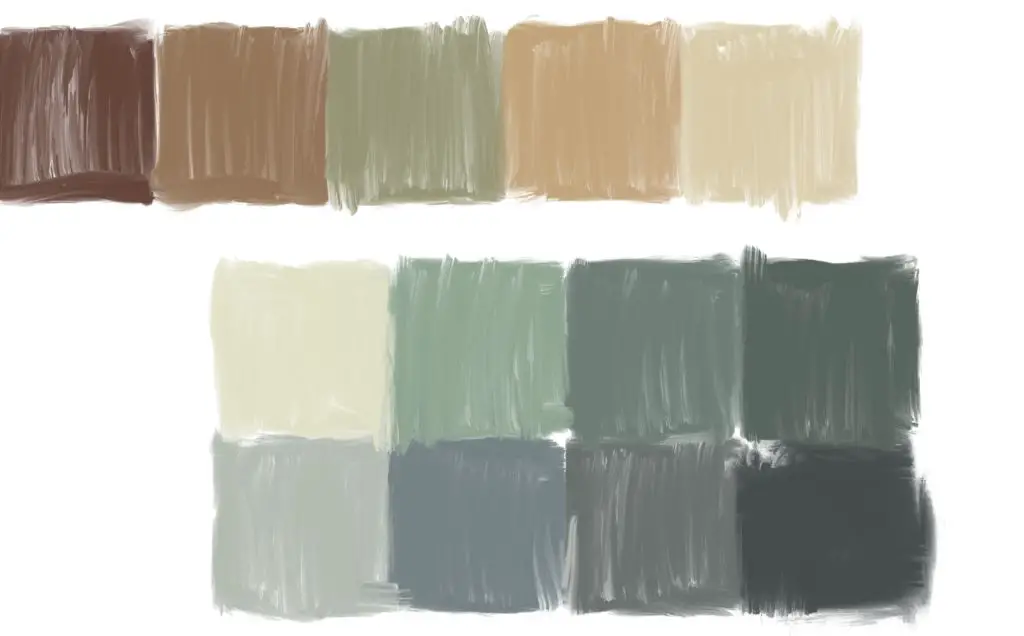
As previously stated, a good place to start looking for a teal colour palette is to search for it in the natural world. Blue and teal pigments is rare to see in the world without the use of artificial sources, but it can be found, if one knows where to look. For example, copper tarnishes into a verdigris that, at certain times, can appear teal, especially if maintained properly, and using that kind of rustic, mottled look of tarnished metal adds a lot of character to a design. You can incorporate verdigris copper into a piece with plenty of shades of warm, sandy yellow and even a few splashes of red for an artwork that has both character and a soothing, nostalgic mood.
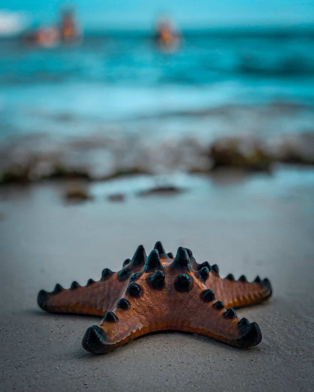
However, if nostalgic and old-fashioned isn’t the energy that you’d like to involve in a design, either interior or exterior in nature, another option found in the natural world is to look for teal in nautical elements.
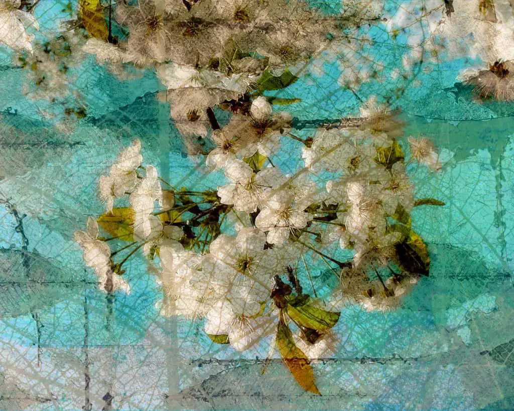
Certain bodies of water can reflect a teal colour, and, when paired with a white sandy beach, the combination is breathtaking. Similarly, tropical fish and some types of snail and sea crustaceans have scales or shells that exemplify that bright blue-greenish tone, meaning that leaning into a sea theme in your designs can feel like a perfect way to incorporate a teal-based palette.
Consider, for example, an interior furniture set with beige pillows, overlaid with a design of teal and green tropical fish and seashells, paired with curtains or a carpet that shows, among other shades of blue, teal and cyan. Combine this with a little bit of white, to represent the sandy beach or the clouds passing overhead, and you could have an indoor relaxed beach vacation all brought to life only using careful palette choices and colour theory.
Something that is often forgotten about teal, especially within the natural world, is that it can be a cold colour just as often as it is a warm colour.
Using the colour wheel theory of warm-cold colours, teal is a cool colour, having a blue base with some additions of bright green and even a little yellow, and it often appears in cold locations.
Clear ice without bubbles can appear a deep, resonant teal, as it often seems to be when seen in ice tunnels or glaciers, rather than the more typical snow white. Aurora borealis, also known as the polar lights, is only seen in high-latitude regions in extremely cold locations, and has, among other colours, like brighter greens and even oranges, streaks of vibrant teal.
These uses of cold teal can be paired well with cold colours, like bluish white and the dark purple of the night sky, in order to highlight the vibrancy of it, though it can match equally well with deeper shades of blue, as is usually the case when teal appears in ice tunnels, or in the bodies of glacial ice.
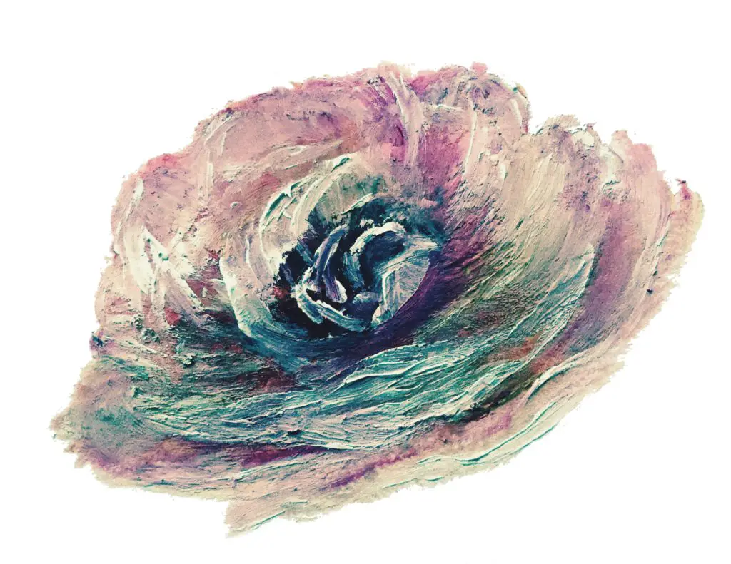
With all of these suggestions, it is evident that teal can be depicted in any type of medium and still create a beautiful visage. However, there are kinds of artwork that will exemplify different features of it in different levels of ease. For example, the metallic, tarnished look of teal-coloured copper verdigris is easier to emulate in art, multimedia pieces that include actual tarnished copper within them, or even textile arts, since these are the ones that allow you to include the most texture.
For deeper shades of cool teal, such as that in glacial ice, polar lights, or even in reflections of deep, blue-green water, using oil paints or acrylic paints can be the most natural choice. This is not to say that using other paints is impossible, but it will make it easier to skip a few laborious stages.
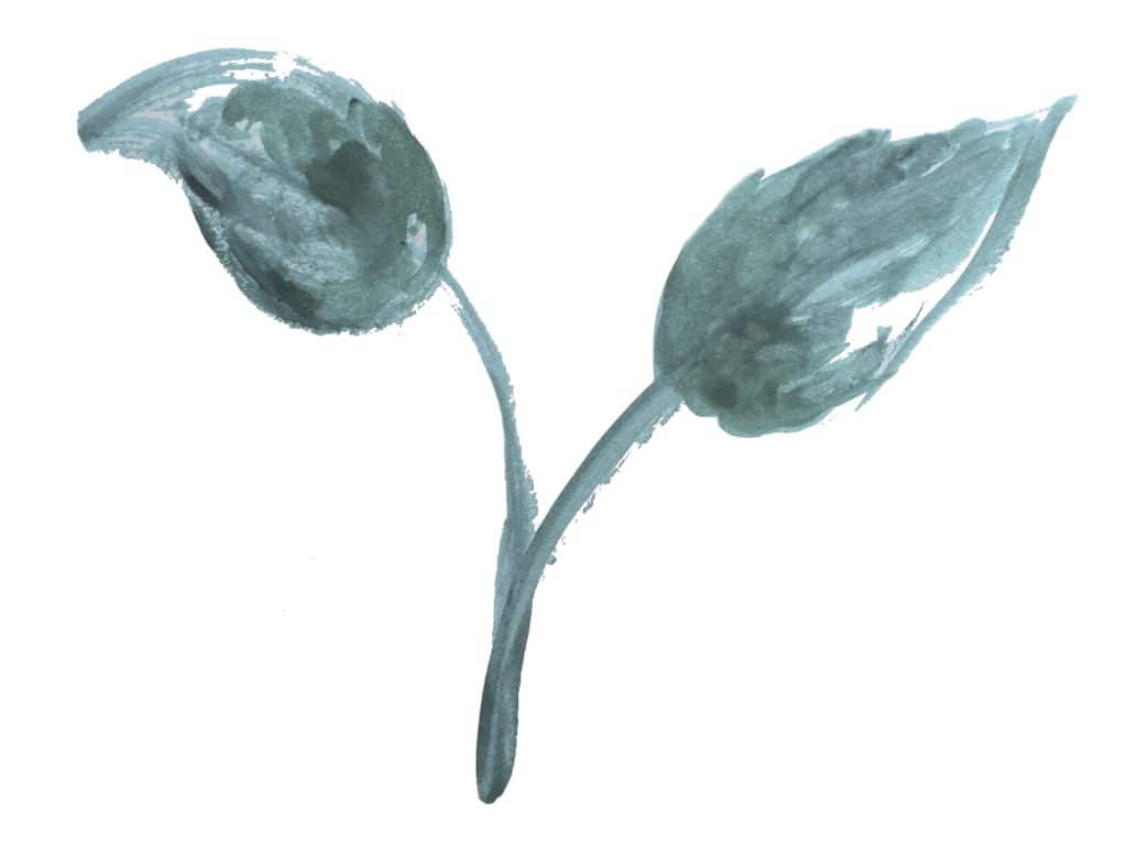
As for watercolour, it can be best to use when depicting teal in living fauna, such as when painting the feathers of birds, the wings of butterflies, and moving water, with various shades of blues and greens weaving together.
The use of watercolour also enables you more freedom in the inclusion of things like lustre or glitter, which can be used to imply depth and texture that is difficult to achieve with watercolour on its own.


As demonstrated by this article, as well as the many places teal shows up in the world, both in nature and in man-made structures and designs, there is no end to the versatility that teal possesses.
Because blue-green shades like teal, cyan, and turquoise straddle the line between cold colours and warm shades, this means that they can be used in conjunction with many different colours to create palettes of all kinds of attitude, energy, context, and symbolism. The only way to tell exactly what kind of change teal will have upon your work is to start using it, and the best way to start is to look at the many ways it is used already in our world.