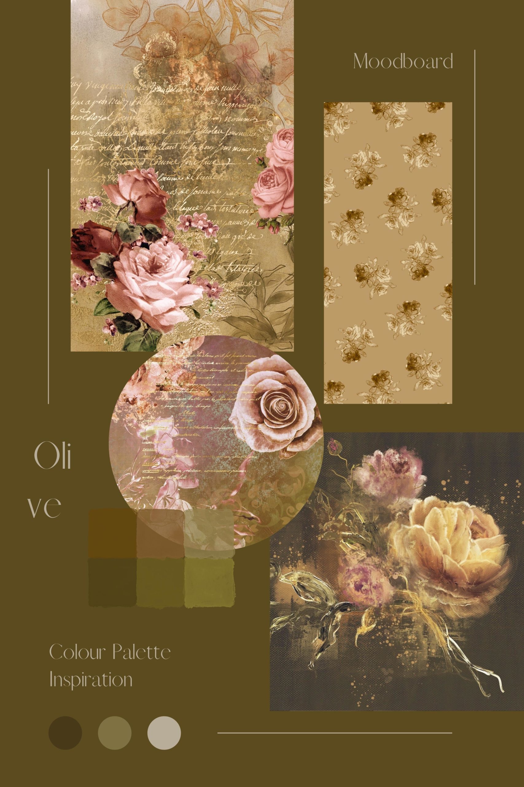
Creating a colour palette with olive green is a matter of selecting the right particular shade of olive, of which there are actually very many!
While people might expect olive to only be the brown-tinted green of olives swaying on the boughs, the colour “olive” can be categorised as anything from a jewel tone, a mud brown-green, to a near black. It also represents the green undertone of black olives, even as they nearly don’t have any colour at all, their sparkling brown is only seen in the right light.
With this being our aim, the main divisions of olive as a colour can be defined as such: olive green, the main baseline colour; olive drab, which is the colour of military uniforms and, despite its name, it’s boring in the least; olivine, a jewel tone of olive named after the mineral silicate that it resembles most; and black olive, a type of olive green that is nearly not green at all.
As you can see, with such a variety of colours for us to use, we should consider palette creation to be a more complex process than it normally would be with only one tone.
Olivine
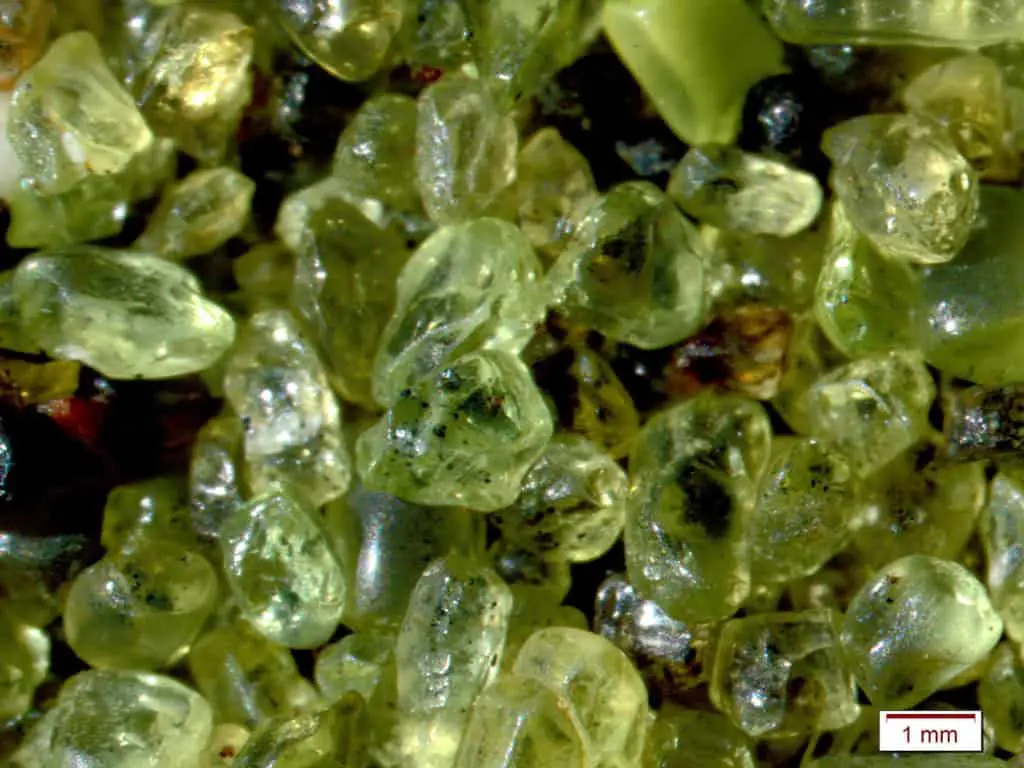
To begin with the least saturated green, olivine is a type of olive green that can best be described as light shining through olive green.
This is because the mineral that it is named after, the olivine nesosilicate, is naturally somewhat translucent, appearing in nature as what appears to be a type of green glass. Despite its resemblance to more humble glass shards, olivine’s origins come from the earth’s crust, at the upper mantle, ejected with lava and sometimes appearing as “green glass”, which is actually eroded crystals of olivine.
As a colour, this type of olive green has more yellow than the baseline, and can be quite variable – in partial light, it can appear very neutral, but in other light sources, it may be very bright and vivacious.
As a colour, it can be either matched with other shades of light green and grey to create a very neutral palette. Or, in a more interesting play, painted alongside bright oranges and dark reds to evoke greater passion, calling upon its origins in the earth’s mantle.
Olive Green
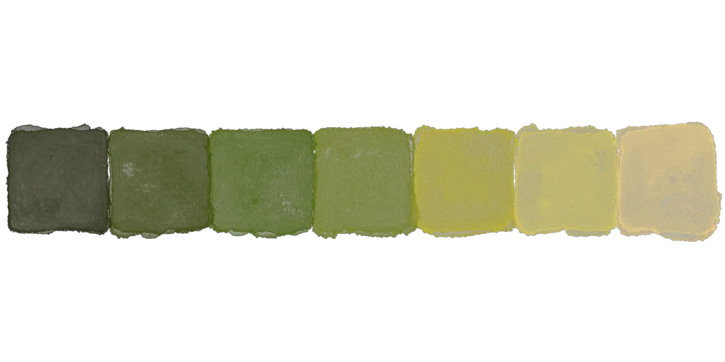
Moving down the line, we have the baseline olive green, the colour that can be used to create all of the other tones and shades in the list.
Throughout history, olive green can be either associated with peacetime or war – either as the green olive branch representing peace after conflict, as the olive wreath placed on the head of a victor in Greco-Roman times, or as the green of some military uniforms and old fashioned helmets during most of the 20th century.
Playing with this mixed history, and its associations as both a calming and an alarming colour in the cultural mindset, you can incorporate olive green to great effect with all kinds of palettes, either solid, mid-tone reds and oranges, or silk white and eggshell.
A personal favourite is to combine olive green with subtle, desaturated peach, ochre, dusty rose and terracotta. Then to paint using a thick brush to create the illusion of light, with olive green used as the main structure of a branch or a horizon, and the yellow being the areas with harsher angles, the light reflecting off of them.
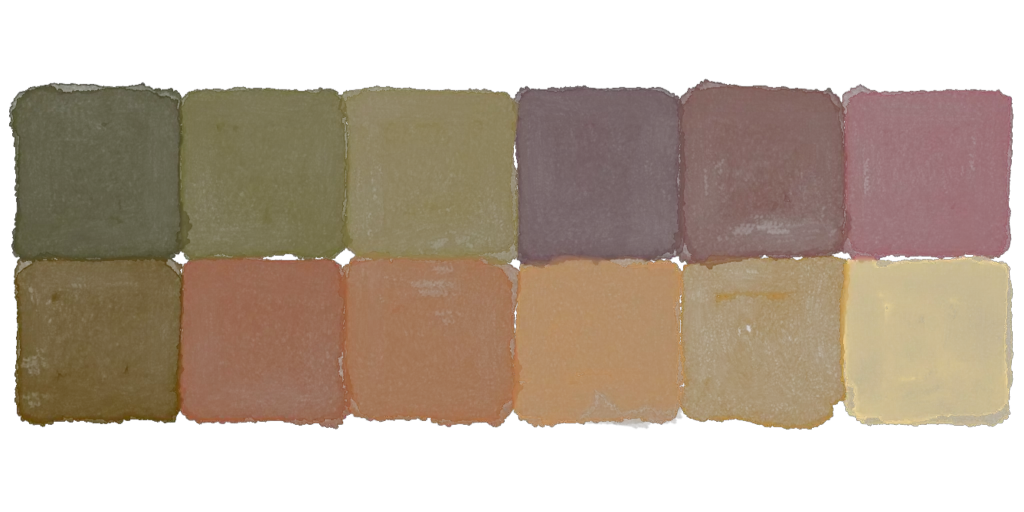
Olive Drab
Olive drab is our personal favourite. It is named as such not because it is boring, though it can be very dull when combined with other colours without much thought or consideration.
“Drab” is a relatively old term, used in this context to refer to a type of desaturated brown, much like “dun” – olive drab being called that because it is an olive green that has been mixed with light brown to create a darker, more polished green.
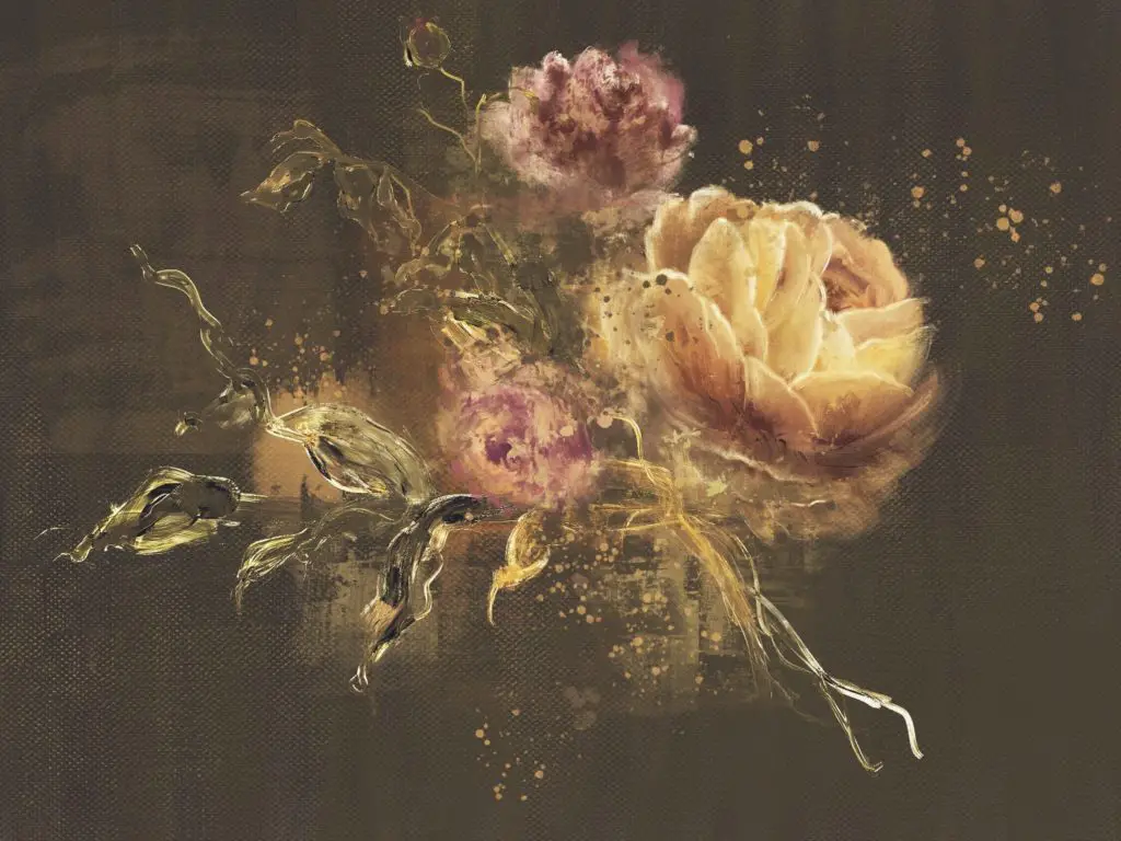
With somewhat grey undertones and a darker overtone, olive drab lands at a completely different colour profile than the other olives on the list. While it still goes very well with khaki, sage, brown, and other shades of green, one of the very interesting colours that it can be paired with is magenta, or other types of light purple and violet.
In nature, many green plants have outer leaves with purple edges, including many types of cactuses and succulents, which can be either olive drab, sage green, or light, dusty violet. And often, the three all combine together within the same patch of cacti, or even on different leaves in the same plants. You can use this palette to depict purple fruit on the body of a prickly-pear cactus, or the spiraling leaves on a succulent, dotted with condensation.
Black Olive
Lastly, we have the olive green that is hardly green at all, but is certainly olive in nature.
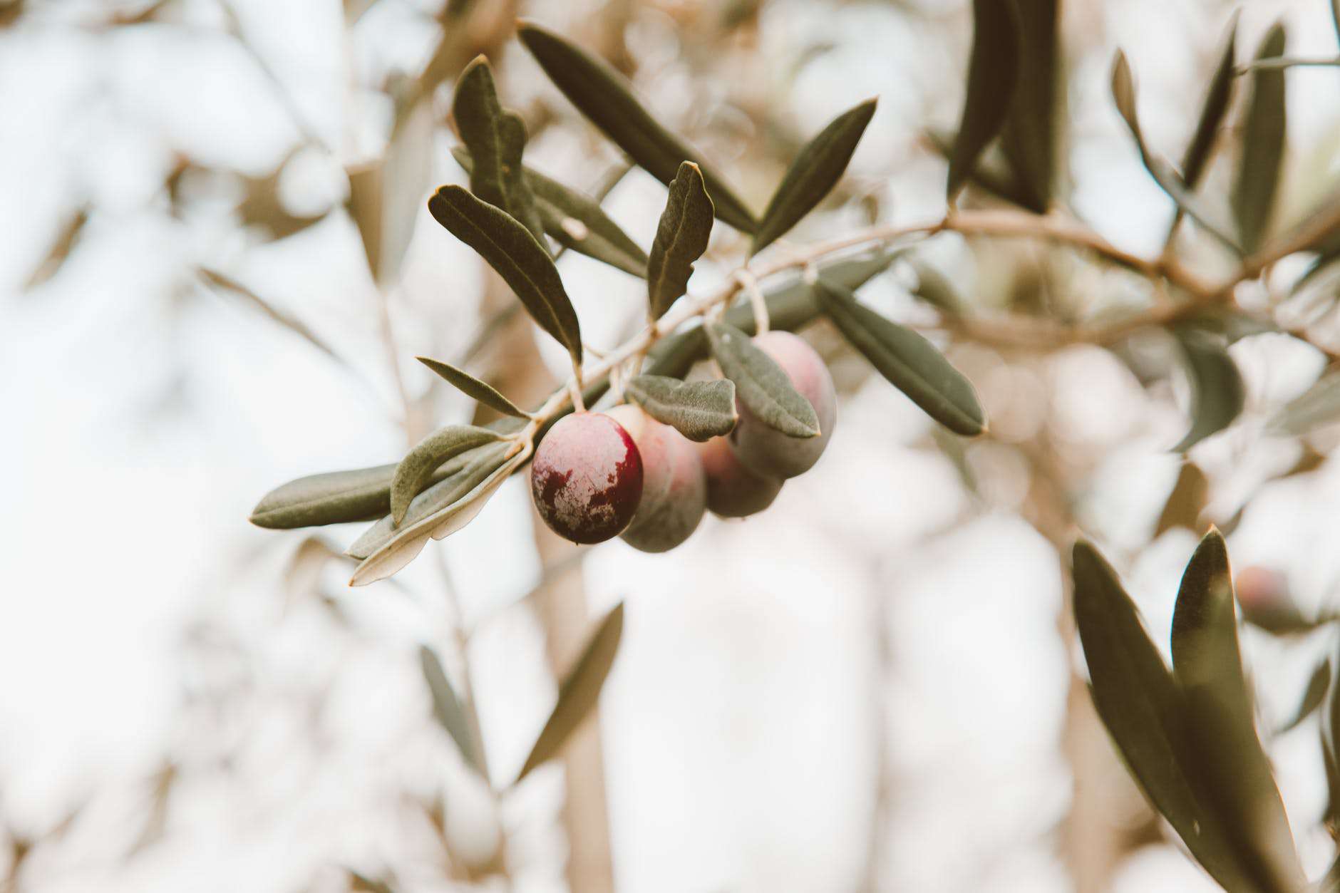
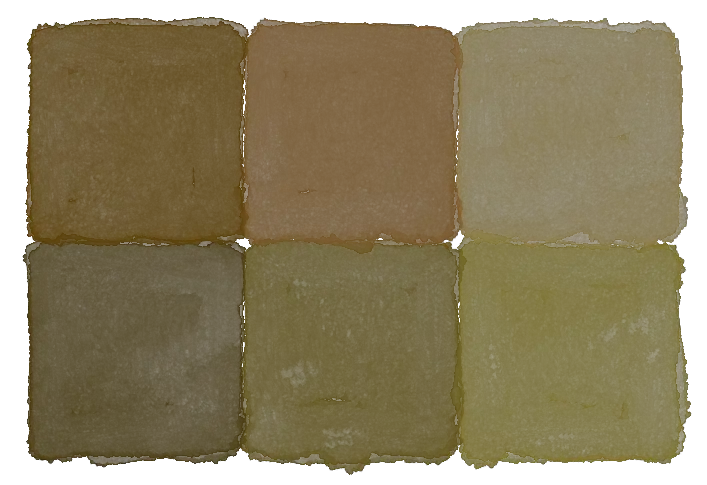
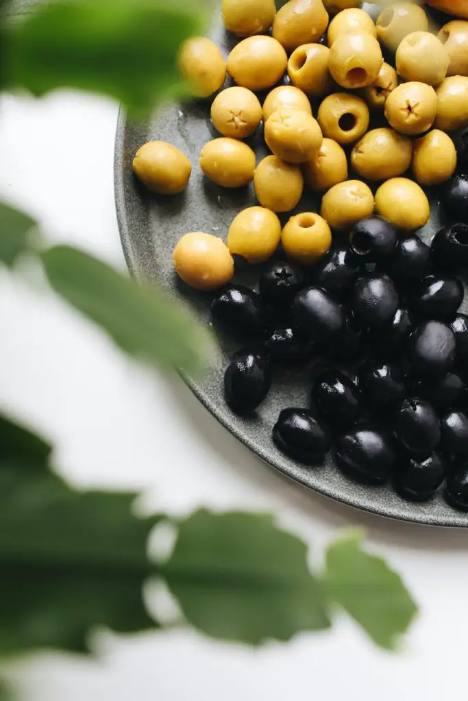
Black olive, which is, of course named after the fruit, is closer to a black or a very deep brown, but when viewed in the correct light, you can see all of the green undertones working hard to give it its complex colour. Because of its dark colour, one of the unexpected colour combinations that compliments this colour to great effect, is, well, olive green!
By pairing this colour up with its base colours, it brings out the complexity that it possesses, and reminds the viewer to look closer and appreciate how many colours are within black olive.
For this same reason, you can also use mustard yellow and light shades of cream, or brownish white, to bring out other complex notes within the same colour, coming together to create a very unique colour palette using all the colours that can be found within black olive naturally.
As you can see, olive green is a colour that has many definitions, and even more uses, all depending on the particular tone and shade of it that you’d like to use in your art.
Whether your intent is to use it for interior decoration, for textile art, or for all sorts of painting, traditional or digital, there are a great many things that can, and should be done with it, all evoking their own meanings and attitudes.

