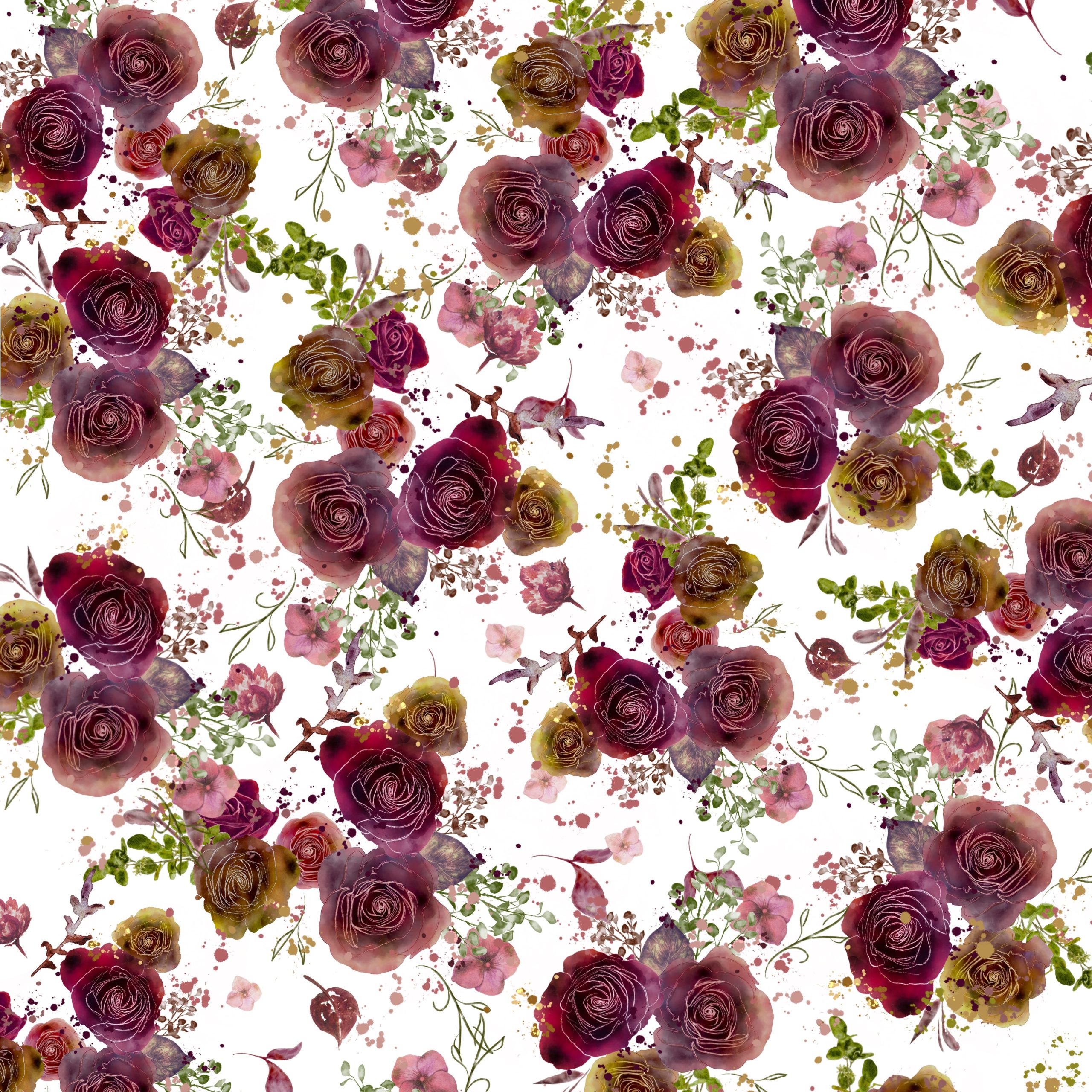
With dark reds, rich browns, and purplish undertones, the burgundy colour palette is a wonderful addition to this fall season going into winter.
The origin of the word “burgundy” comes from the Burgundy region of France, with it being one of the historical regions most known for its production of red wines, which is exactly the kind of colours that the burgundy colour palette focuses on.
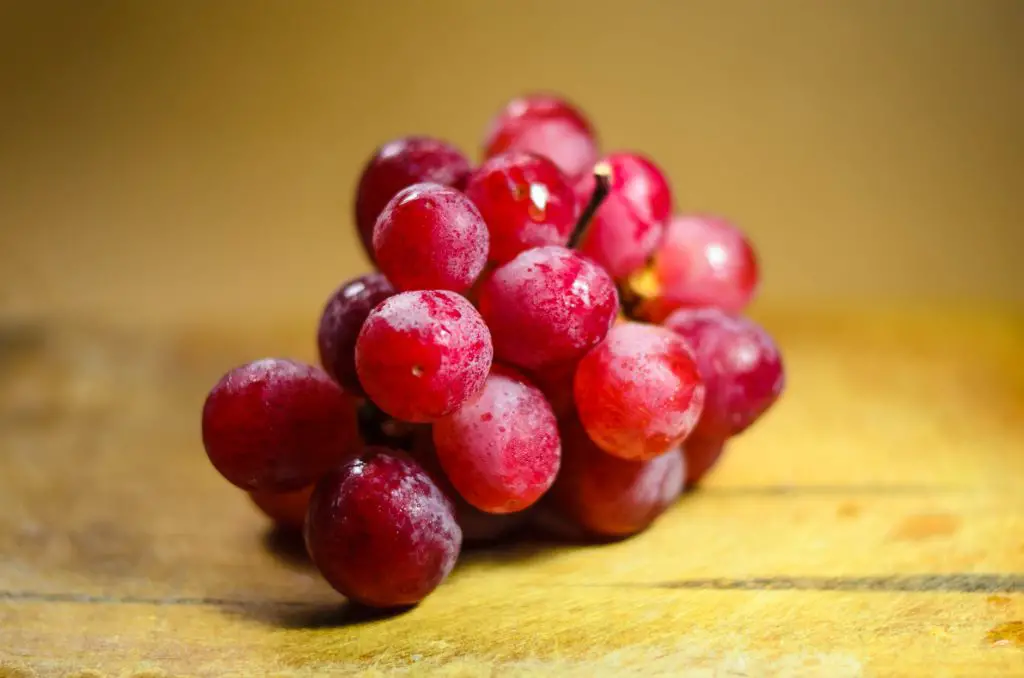
Made from chardonnay grapes, traditional burgundy wine from the region is deep, dry, and colourful, and it is exactly that dry richness that breathes life into dark red as a colour, its drama and uniqueness being exactly what one should focus on when trying to incorporate it into art, graphic design, and interior decoration choices.
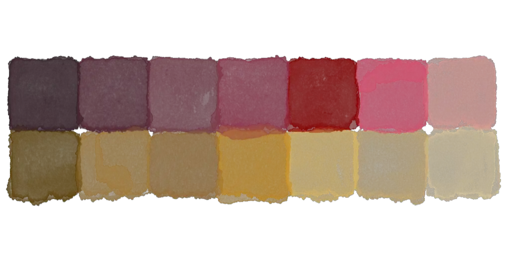
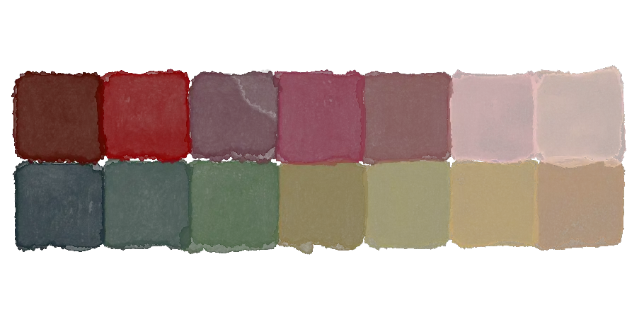
While there is a distinct burgundy colour – burgundy red, which the French actually most commonly refer to as Bordeaux red themselves, referencing a different wine-producing region! Colour palettes that are inspired by this colour go much farther than just this colour alone.
For example, one can use burgundy red (hex triplet #800020, for those who are curious), paired with a lighter, pinker shade of amaranth, a darker shade of mahogany red – which has a lot of brown undertones – and even something more blue in nature, like a splash of wine red.
However, one can go in a completely other direction and choose colours that accentuate the distinct, deep redness of burgundy, making it seem like red blood on snow, by selecting colours like eggshell white, and deep, saturated black.
Regardless of the direction you choose, it is important to remember that red is a distinct colour that does not like to be relegated to the sidelines. Colour printing, especially from a digital design standpoint, needs to be calibrated with redness as the main goal, since red, when not given the proper pigments and printing, can end up looking washed out. Sometimes, dark red shown in the wrong light can seem more like dusty brown, or even like dark blue, so make sure to centre the red in your project and give it the attention it deserves.
So, with this in mind, what are some places of inspiration for a burgundy colour palette?
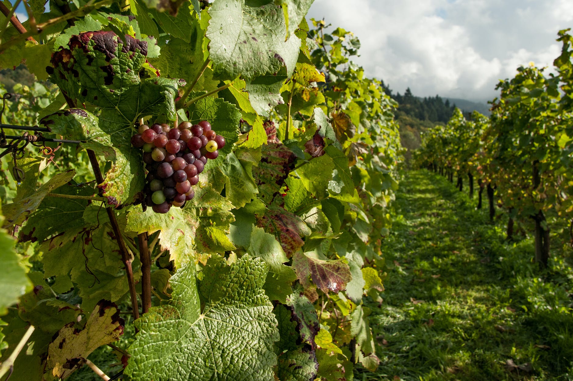
Well, for an obvious choice, one can go back to the origins of the colour and examine winemaking as inspiration. Burgundy wine is made from chardonnay grapes, which are actually green on the vine – however, as they ripen, they begin to take on a slightly pinkish outer layer, which is a beautiful colour in and of itself.
For a darker grape, however, you can look at chardonnay rose grapes, which are, when ripe, a colour of red so deep and dark it is nearly black, with a dusty outer layer of bluish white. Selecting from these shades can be an interesting source of inspiration, and looking even further at the source of the colour, burgundy rouge is a beautiful shade of red, and can be, in and of itself, a source of inspiration.
However, if you’ve already explored wine coloit’s and found them wanting, another good place for finding inspiration for a dark red palette is the natural world.
Maple leaves, as fall settles, lose chlorophyll and grow into an intense red shade that looks beautiful when pressed and dried. One thing I especially like to do in the autumn is collect red leaves right before they fall and press them between the pages of a book, letting them dry until their natural colour is preserved without fading to brown. You can use these dried leaves to make paper bookmarks by cutting out the page that you dried them on and laminating it, but you can also photograph these bright red leaves and used them for digital designs, or to select colours for digital painting.
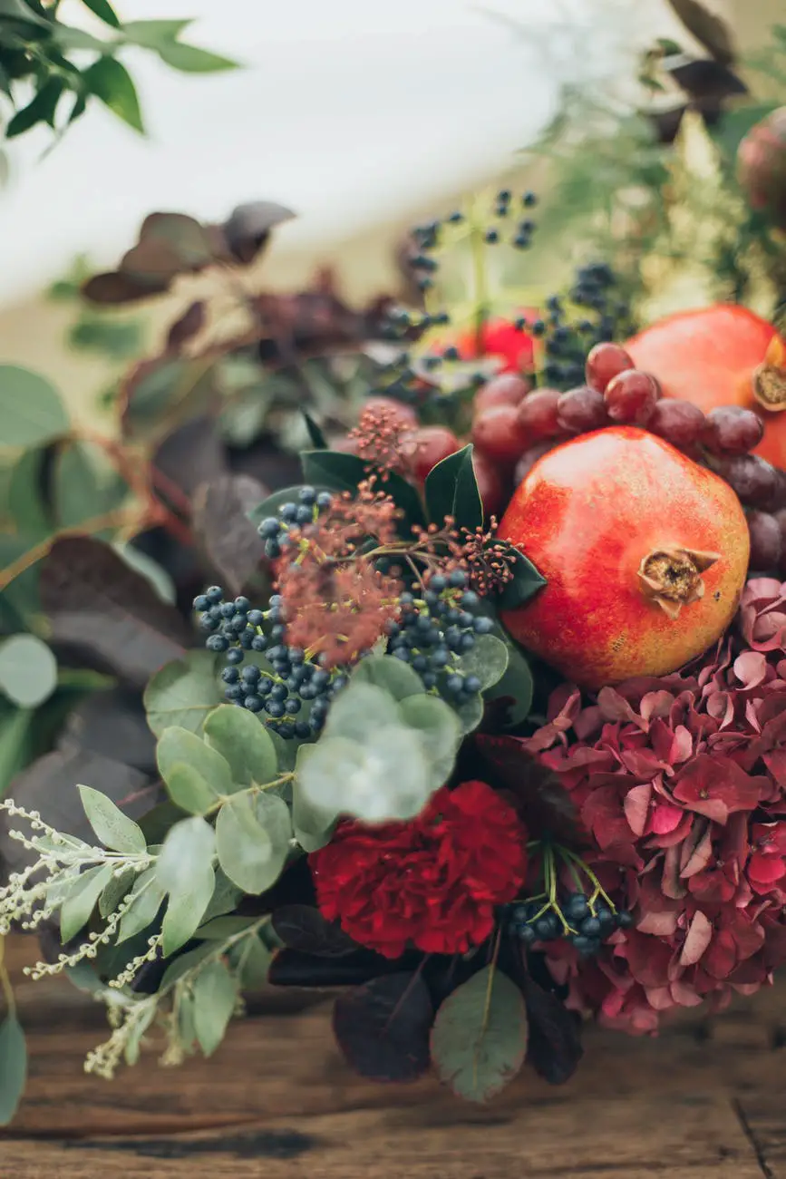
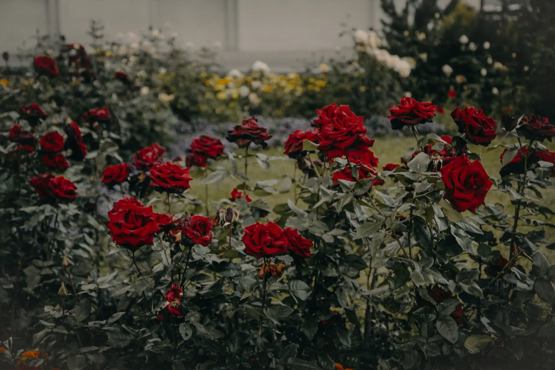
Other surprising sources of the burgundy colour palette in the natural world include the feathers of birds, like cardinals, painted bunting, bright red tanagers, and the wings of certain species of blackbirds. While finding these particular feathers in person is inadvisable, I find that looking at them can be inspiring all on its own. You can also find these colours through looking at dark red roses, begonias, and some orchids, or even by looking at particular types of red earth, for an especially earthy colour pattern.
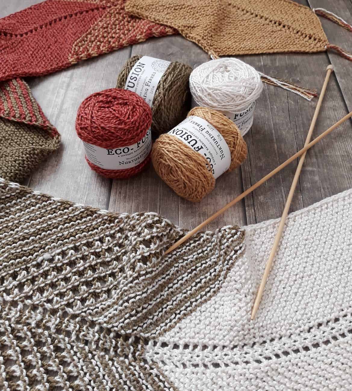
Once you have a complete colour pattern, there are many ways for you to use that inspiration. I find that burgundy-coloured yarn makes for wonderful crafting projects, whether you use it for knitting dark red scarves, or to incorporate into two-dimensional art by winding it around pins on a canvas.
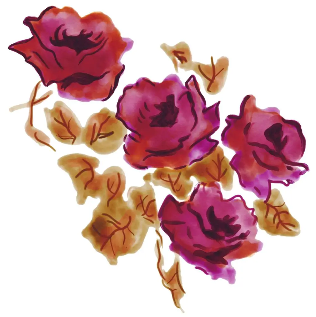
You can also acquire a watercolour set in dark red shades, which, when painted on stark white paper, resembles burgundy wine to the utmost. You can, in fact, even paint with wine! It isn’t recommended for you to invest in high quality wine in painting, you can get small amounts of red wine and regard it in much the same way as you would water colour. Incorporating small amounts of black coffee to the same painting can allow you to create a fully-shaded piece in reds, blacks, and whites that is very unique in its origins.
Burgundy red is a colour with much history and appears with frequent, though highly memorable, occasions in the natural world. Using it in your art or design can create a distinct effect, seldom seen but often remembered. Though it is vital to pair it with the correct colours to make sure that it does not become muddy or washed out, and to present it in the appropriate light and material, it is a versatile shade, and inspiration for palettes featuring it as the main player are easy to come by, when one knows where to look.
With all this in mind, the only way to know if a burgundy colour palette is the one that is perfect for you is to go out there and create a colour palette featuring it, and to experiment with paints in order to use it for your very own.