Nature’s Palette: Autumn Fall 🍂

Autumn fall colour palettes can be found all around us, with inspiration that can be incorporated from the natural world as well as from everyday objects and designs. The most …
Autumn fall colour palettes can be found all around us, with inspiration that can be incorporated from the natural world as well as from everyday objects and designs. The most …

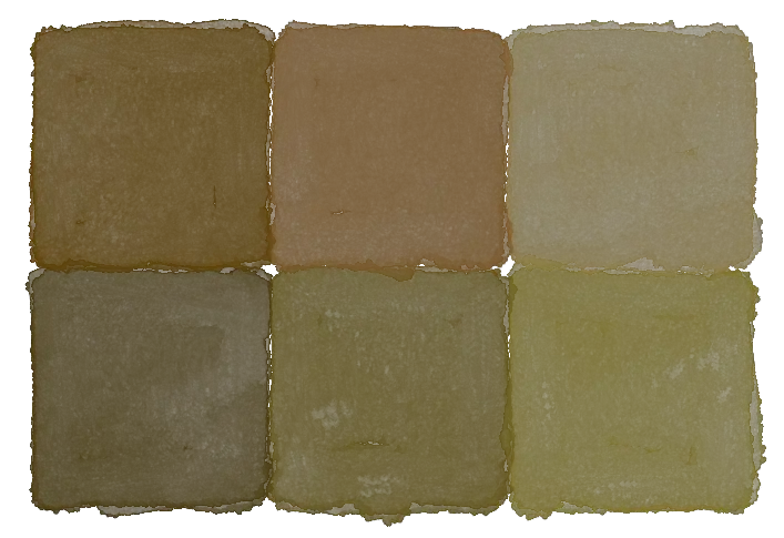
While burnt orange is not a standard colour with a defined appearance, it is widely agreed that it is a dark rustic orange colour, with a distinct auburn appearance. This …
When it comes to finding the perfect olive green colour combination, there are a few things you need to keep in mind. First, consider what mood or feeling you want …
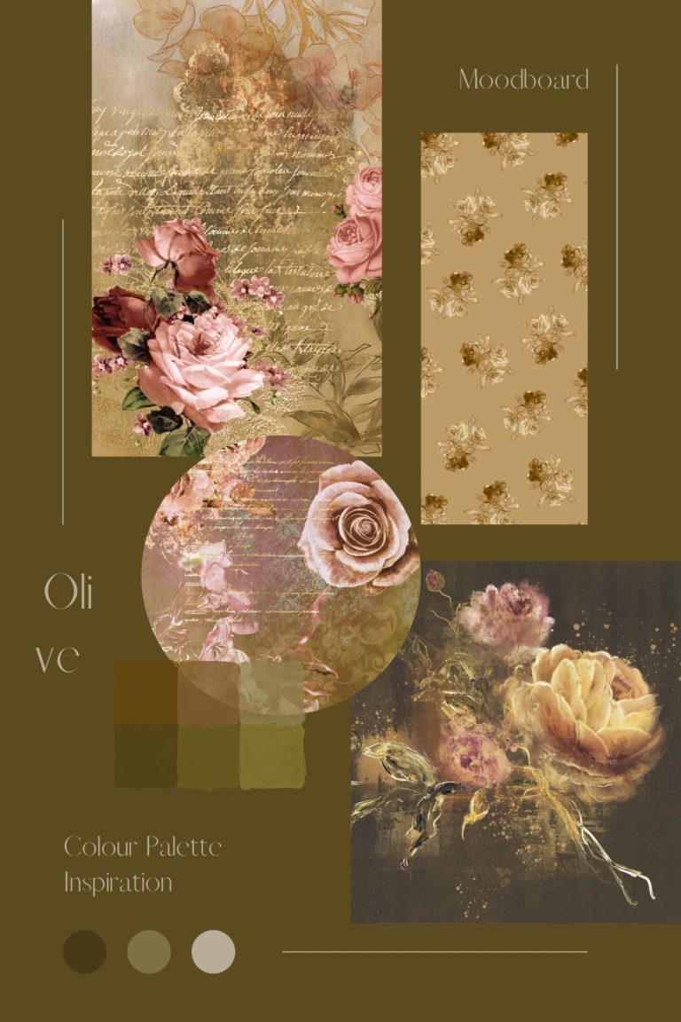
While people might expect olive to only be the brown-tinted green of olives swaying on the boughs, the colour “olive” can be categorised as anything from a jewel tone, a …
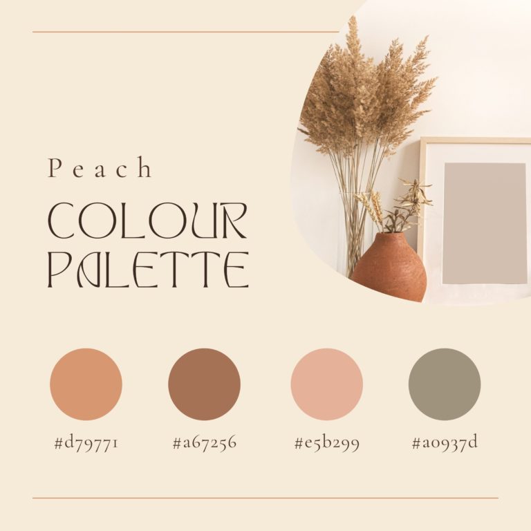
Peach shows up in many places in the world, both through flora and fauna, giving you much room to explore when trying to construct a peach colour palette to use …

Colour theory can be a lot more complex than just learning about primary and secondary colours, but with the right tools and explanations, colour blending and colour coordinating can be …

A winter wonderland colour palette tends to be cold in nature, as obviously implied by the nature of that season. So if those are the colours you are looking for, …

There are many benefits to painting with oils, especially when it comes to the hardiness of oil paints once they’ve dried completely and been allowed to cure. Even when unsealed, …

Learning to mix oil paint is one of the first steps to getting into oil painting. Various factors are taken into consideration, such as the type of paint you are …

Many art pieces are timeless, but sadly, like all things, they have a limited life. Oil paintings are one of the prevalent art pieces you may wonder about. If so, …