magical stories begin here…
Ochre Colour Palette
Basing a palette around the colour ochre is not only easy, it’s been done since prehistory! Ochre – also known as ocher, or, when it contains a lot of hematite to create a reddish-yellow colour, ruddle, is a natural pigment derived from clay earth pigment. It is made from a combination of clay, sand, and other particles of earth, suspended in ferric oxide.
The name “ochre” comes from the Ancient Greek “okhros”, meaning “pale”. Yet, despite the misleading name, ochre is actually a wide variety of earth pigments used since time immemorial to paint with, and comes in a variety of colours, from as pale as a turmeric-like yellow to as dark as burnt sienna, and even a colour known as purple ochre.
All of these have been used to create art for a long as humans have been employing pigments as part of illustration, and make of a vital portion of the colours used in cave paintings. While ochre as a pigment can represent any combination of colours, each containing some level of yellow, we’ll be focusing on ochre a colour in its own right when it comes to creating a colour palette based on it, specifically by examining it as a rustic, brownish-yellow.
If you’ve ever seen any paleolithic cave art, whether it be in a museum or looking at pictures of it online, you’ve almost certainly seen yellow ochre at play. Most famously, the famous paintings of round-bodied horses at the Lascaux caves in France are painted with yellow ochre, the pigment used to paint the top and sides of the animals on the cave wall.
Because these paints were made using natural pigments, likely suspended in fat or oil of some kind, they can even be regarded as the first use of oil paints! Unlike classical or modern oil painting, however, it is evident that these forms do not use as much layering, but instead rely on techniques of foreshortening and depth that are remarkable, considering just how ancient they are.
For our first example of the colours that can be paired alongside yellow ochre to great effect, we need not look further from these cave paintings: on the surface of these caves, we can see brownish reds and browns so dark they verge on black, used as outlines and shading, as well as creamy white chalk used to lighten areas of the painting. If you’d like to capture this prehistoric simplicity, as well as the storied history of the colour and all its implications have for the field of art and human development, incorporating these simple colours in tandem is a brilliant way to allude to the Lascaux caves, as well as the many times these paints have been used throughout time, by paleolithic and modern humans alike.
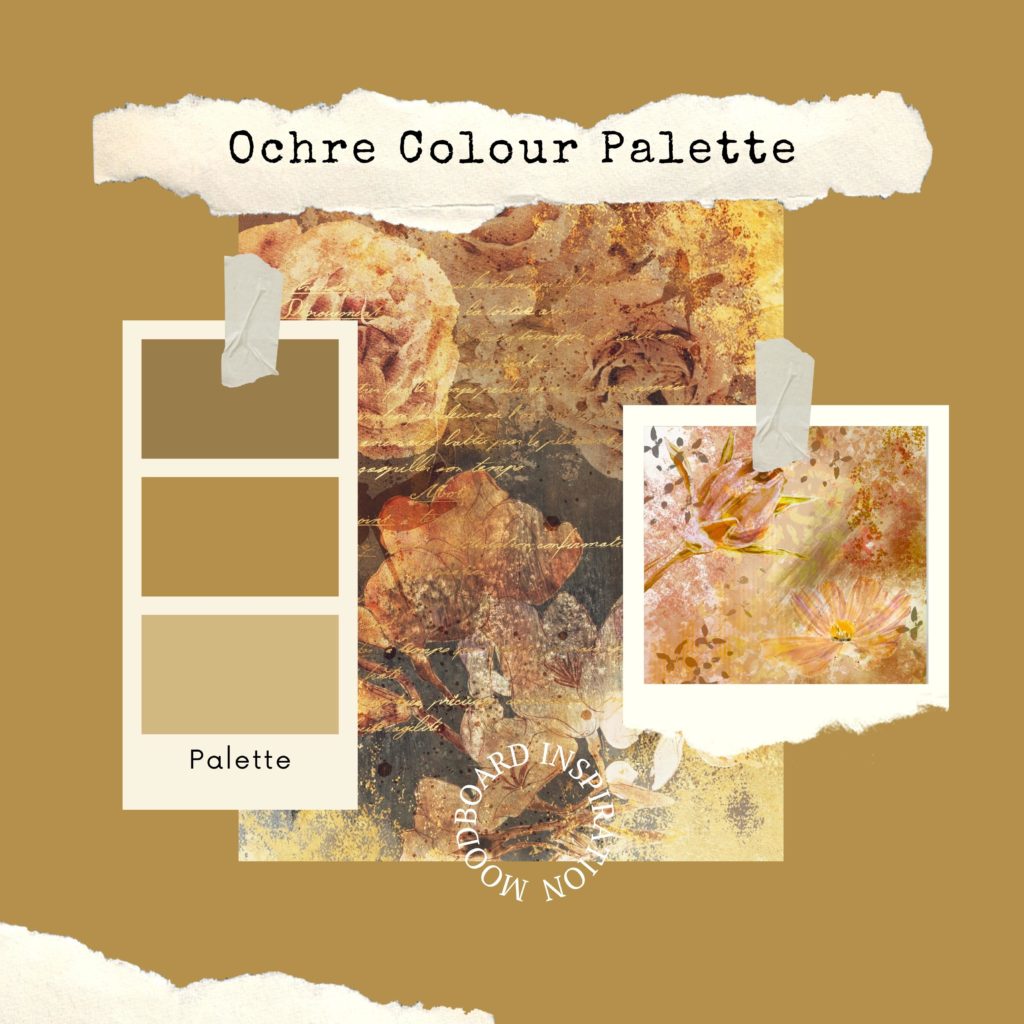
This all being said, there are many more ways to use yellow ochre without it being an object of history books and painters thousands of years in the past. For example, being an earth pigment means that yellow ochre has a distinct personality to it, perfect for representing natural forms, like yellowing leaves, or the crest of mountains covered in pines, making it an ideal colour to have as a baseline when painting landscapes of all sorts. It can represent the yellow sand of a desert, the brambles of a scrubland, or even the yellow-green leaves of a Mediterranean olive grove, each with a kind of style and depth unique to natural pigments made from the earth itself.
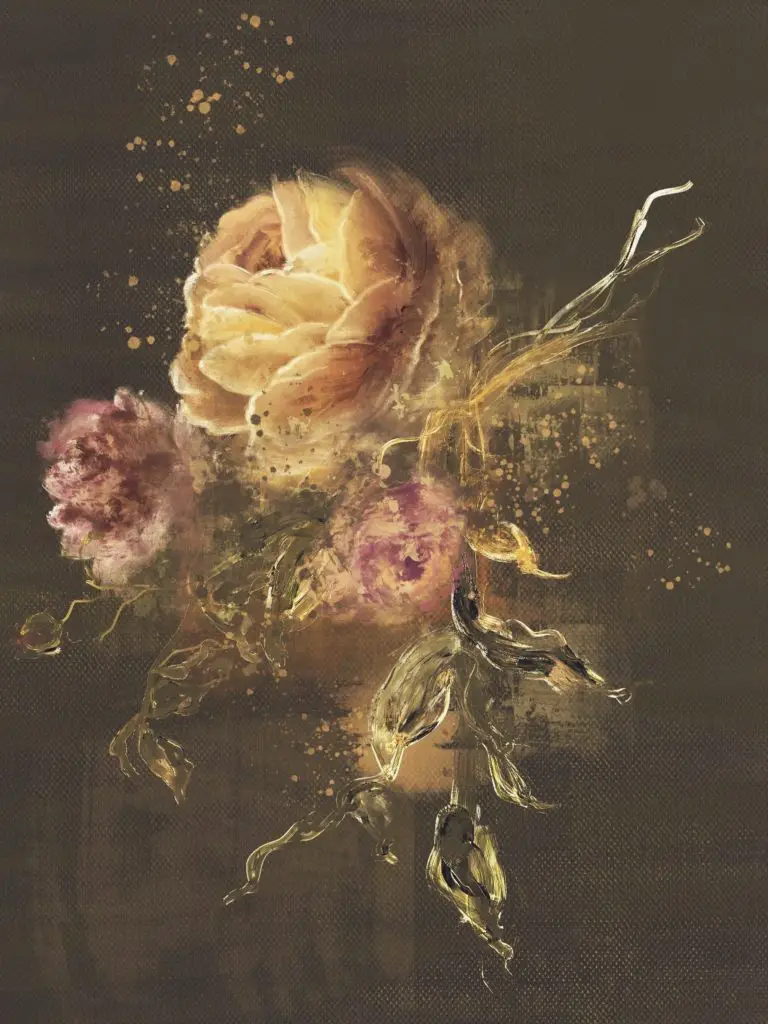
Having such a high sand and clay content means that the colour has great variety to it, and high quality ochre may even have speckling or imperfections within it, making it an altogether unique experience to paint with. For these experiences, consider pairing ochre with vibrant greens and brilliant blues, even searching for similarly unique paints, like blue oil paint made from lapis lazuli, copper, or cobalt oxide.
Ochre, being a yellow colour, is considered a warm tone. Despite this, it is also a relatively neutral type of yellow, containing within it shades of orange and brown that, despite being warm tones in and of themselves, serve to make it a more mellow shade, one that can be used to great extent without it becoming overwhelming.
For these reasons, it’s a very unique colour that can actually be used to great effect in interior and exterior decorations. Throw pillows and indoor carpets, for example, go very well in ochre, as well as any other textile, so long as it has a distinct texture and feel to it. Heavy fabrics, brocades and wools of all kind can be used in all shades of ochre to create art pieces with plenty of character, which compliment neutrally-coloured walls and furniture.
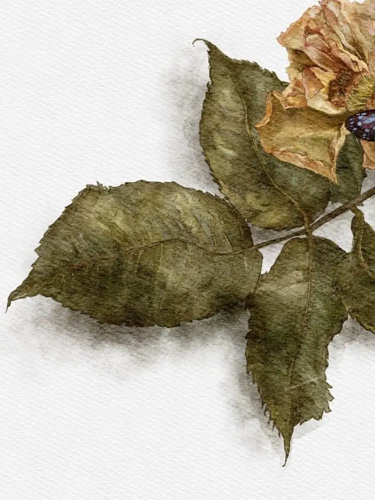
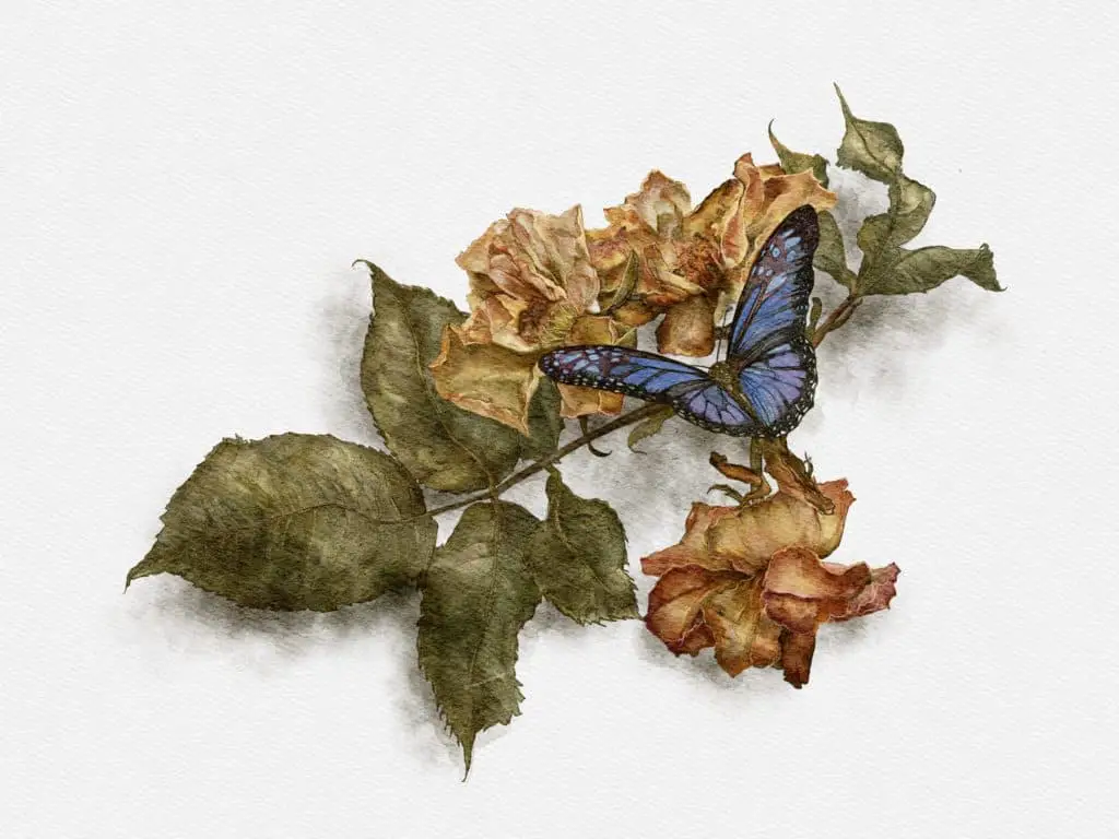
Taking a butterfly on a faded flower as my subject allows me to explore many aspects of drawing and painting. Firstly, the position of the various elements, the leaves, the flowers and the butterfly along the branch allows the viewer’s eye to run from one side of the painting to the other.
The colour palette can also be explored with each element subject to different hues and ranges. And lastly, there is a contrast between the way each element is approached, the relatively flat leaves, the more detailed and complex flowers and the contrasting colours of the butterfly itself. A perfect range of varying tasks to be undertaken.
Firstly, I established the main points of the composition, starting with the butterfly itself. This will eventually be the main draw for the eye once the colour is introduced and is also in the foreground of the painting. Positioned three-quarters of the way across a line from bottom left to top right, its position is chosen to draw the eye across the page. The outline was established, some detail began as a reference point and some small points of relevant background were established. This sees the complete sketch of most of the elements that the painting is made of. The branch and the additional leaves are positioned, more detail of some of the leaves is suggested and planned out and the composition and positions start to take shape. The flowers, which sit in front of the leaves but behind the butterfly, are beginning to take shape. One is positioned to establish the form and shape of this element.
The remaining flowers along the top of the branch are added. Things do start to look a bit confused at this point due to the two-tone nature of black pencil on a white background but it is the contrasts of the paint that will make each element stand out against each other, the lines are just the working mechanics that will guide the digital brush later on. The final flower is placed, each element is in its place. The remaining detail is added to the butterfly. It is time to start adding colour to the piece.
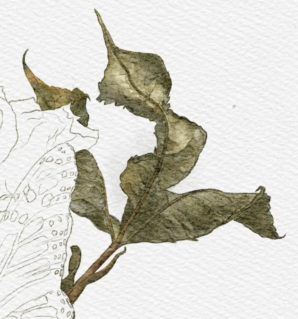
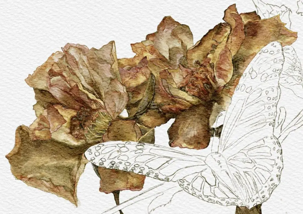

Starting with the elements farthest back – the leaves – the blends of green and light brown are used to create tone and texture, the contrasts between suggesting contour and movement. This close up shows that the colour palette used is fairly simple and it is the contrasts between the hues and highlights rather than the use of a broad range of colours that lifts the two-dimensional drawing into something more lifelike.
The same applies to the flowers themselves. It is the contrast of browns, reds and yellows which create the illusion of folds and texture of the flowers, the result is a series of tightly packed swirls of petals. The detail here shows the power of highlights, of certain darker lines or more shaded detail which creates the contrasts which suggest depth and dimension. And when you pull back you can see the contrast between the more complex brown-yellow of the flowers and the plainer greens behind them. And further contrast is created by adding the blue details to the butterfly itself. Although all three areas – the green leaves, the yellow-brown flowers, the blue creature – have fairly toned down palettes, it is the contrast between the three which makes each stand out from the other. Although the palette remains subdued from one element to the next, there is more than enough variance to make each stand out from the other. Add to that the contrast with the white and shaded backdrop and you have a great and well-observed painting.
Woodland Tales
Protecting our natural wildlife is more important today than ever before. With climate change, the lives of…
