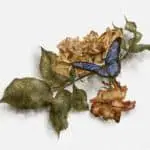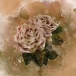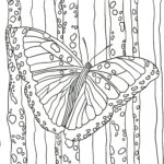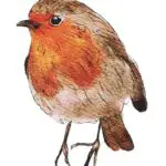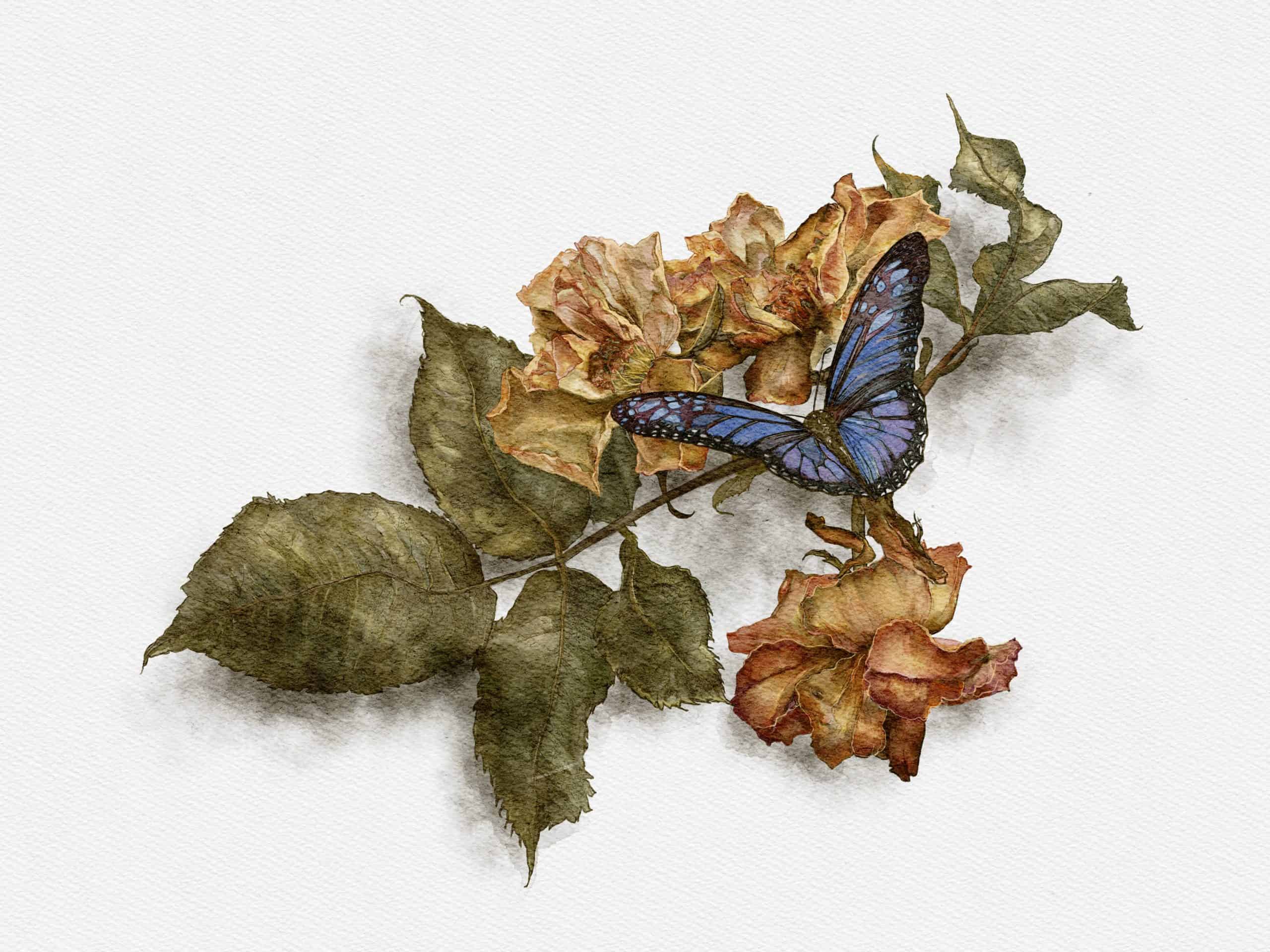
Taking a butterfly on a faded flower as my subject allows me to explore many aspects of drawing and painting. Firstly the position of the various elements, the leaves, the flowers and the butterfly along the branch allows the viewer’s eye to run from one side of the painting to the other.
The colour palette can also be explored with each element subject to different hues and ranges. And lastly, there is a contrast between the way each element is approached, the relatively flat leaves, the more detailed and complex flowers and the contrasting colours of the butterfly itself. A perfect range of varying tasks to be undertaken.


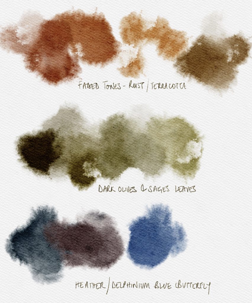
Although the palette remains subdued from one element to the next, there is more than enough variance to make each stand out from the other. Add to that the contrast with the white and shaded backdrop and you have a great and well-observed painting and a great way to explore this superb digital tool.
Some might argue that the digital revolution, whilst being advantageous in most areas has, to a degree, taken some of the skill away from more creative endeavours. Sound technology has opened music up to those who might not otherwise have had a chance to get involved in such an art form, video advancements have made film making affordable and self-contained, and digital art packages have made illustration and painting more convenient in the busy modern world.
But, these are all just tools, means to an end and packages such as Procreate, different from paint or brushes or canvas, but in fact, acts as all three of those items. There is also something of a cost-saving to be had from using such technology – the paints don’t run out, the brushes don’t need to be replaced and a new canvas is available at the click of a button. You can also undo any mistakes, something prolonged if using pencils, difficult and time-consuming in oils and almost impossible in watercolours.
Tools & Resources
- Procreate Realistic Watercolour Paintbrush & Canvas Set: https://creativemarket.com/Jazwinska/4696269-Realistic-Procreate-Watercolor-Kit
You may also like…
- Step-by-Step Watercolour Painting Tutorial: Peach Rose (In Procreate)
- Step-by-Step Watercolour Painting Tutorial: Flower Branch With Blue Butterfly (In Procreate)
- 3 Tips on How To Think More Creatively
- Digital Oil Painting Flowers in Procreate
- Creating Art in Procreate, Your Digital Sketchpad
- How To Paint A Realistic Watercolour Hydrangea Flower
- Learn Watercolour Rose Painting In Procreate (Time-lapse)
- Step-by-Step Watercolour Painting Tutorial: Antique Peach Roses (In Procreate)